


Posterize Image
Reduce a photo to a few flat color levels, like a screen print.
Drop a photo
or paste with ⌘V · JPG · PNG · WebP, stays on your device
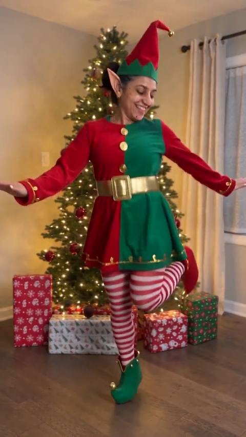
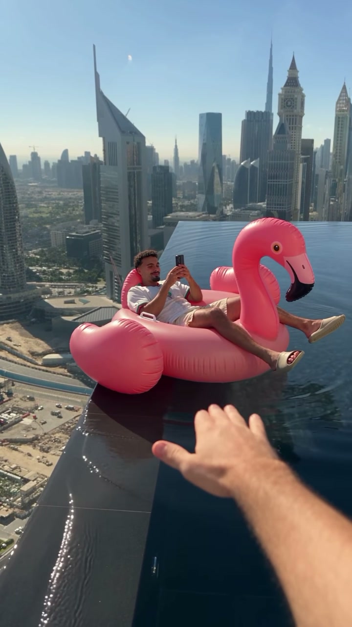
No photo handy? Try one of ours.
 Stencil generator →
 Photo to sketch →
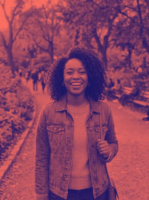
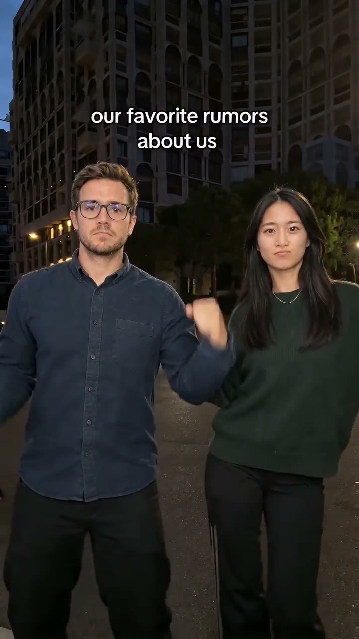
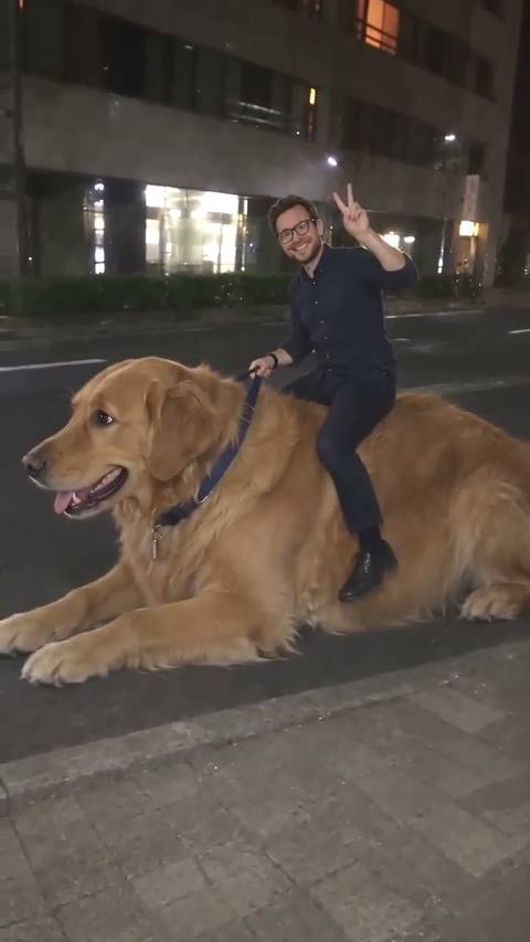
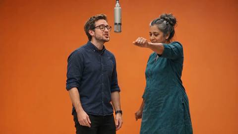
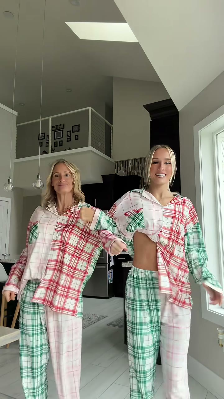
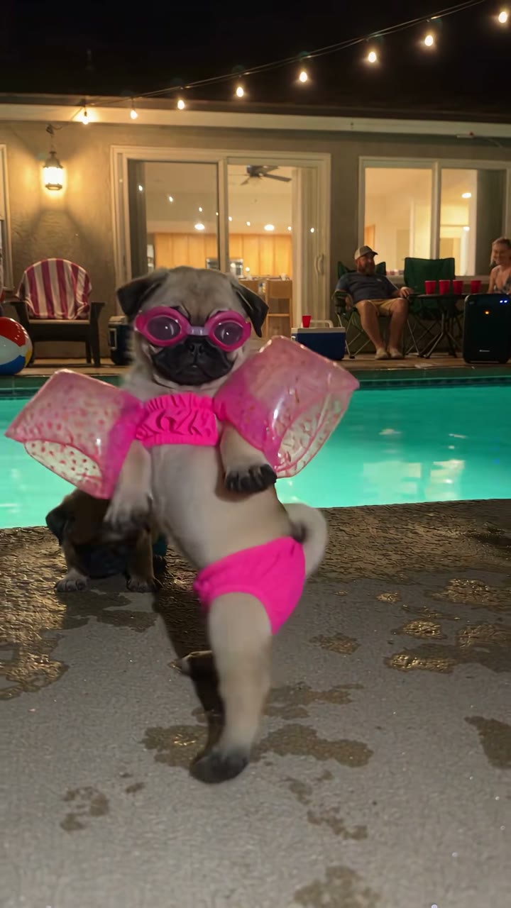
Posterize Image examples.
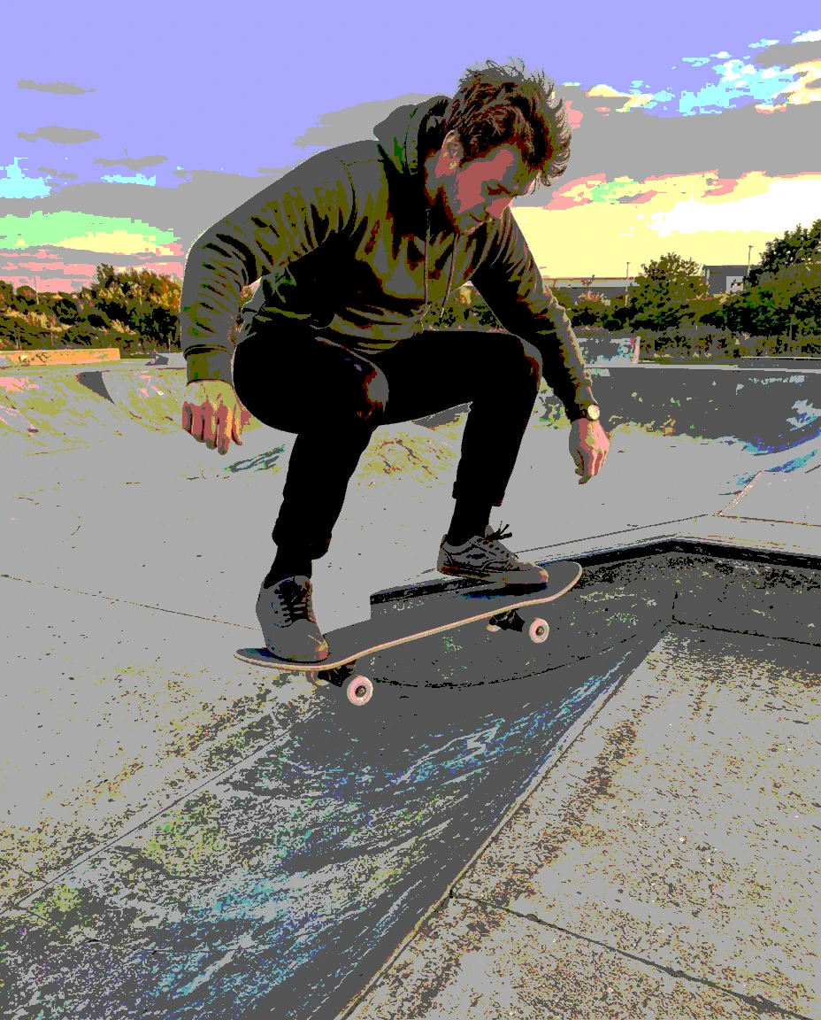
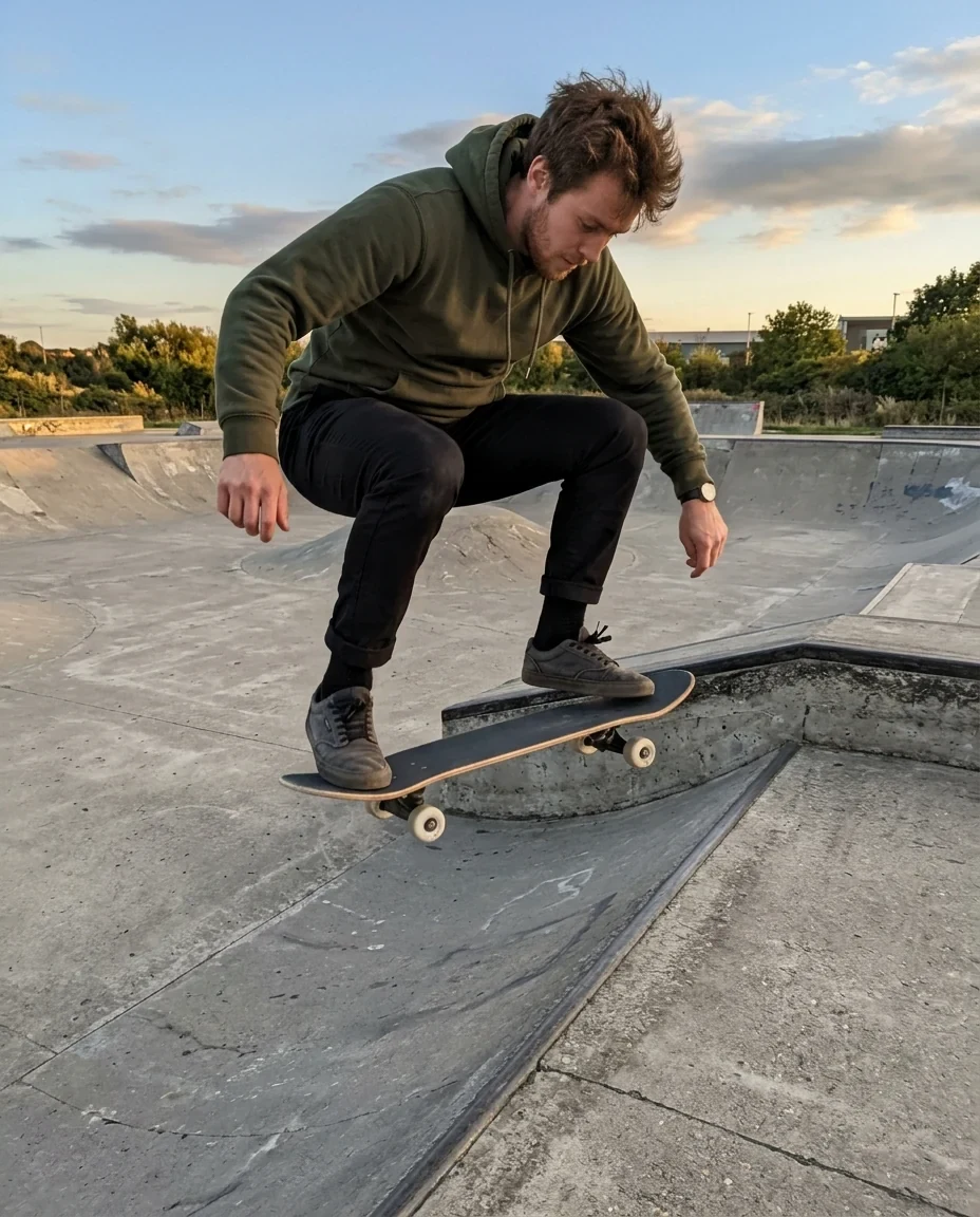
4 levels
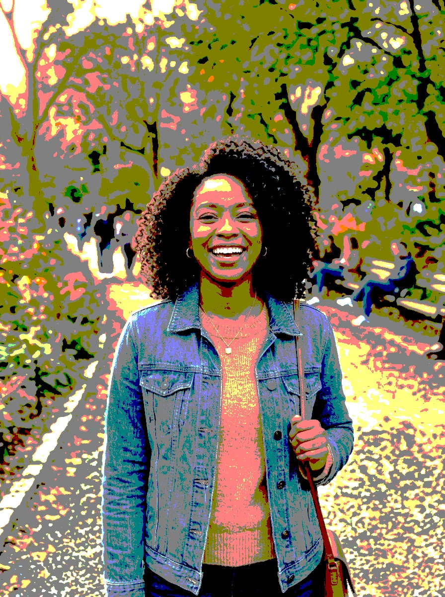
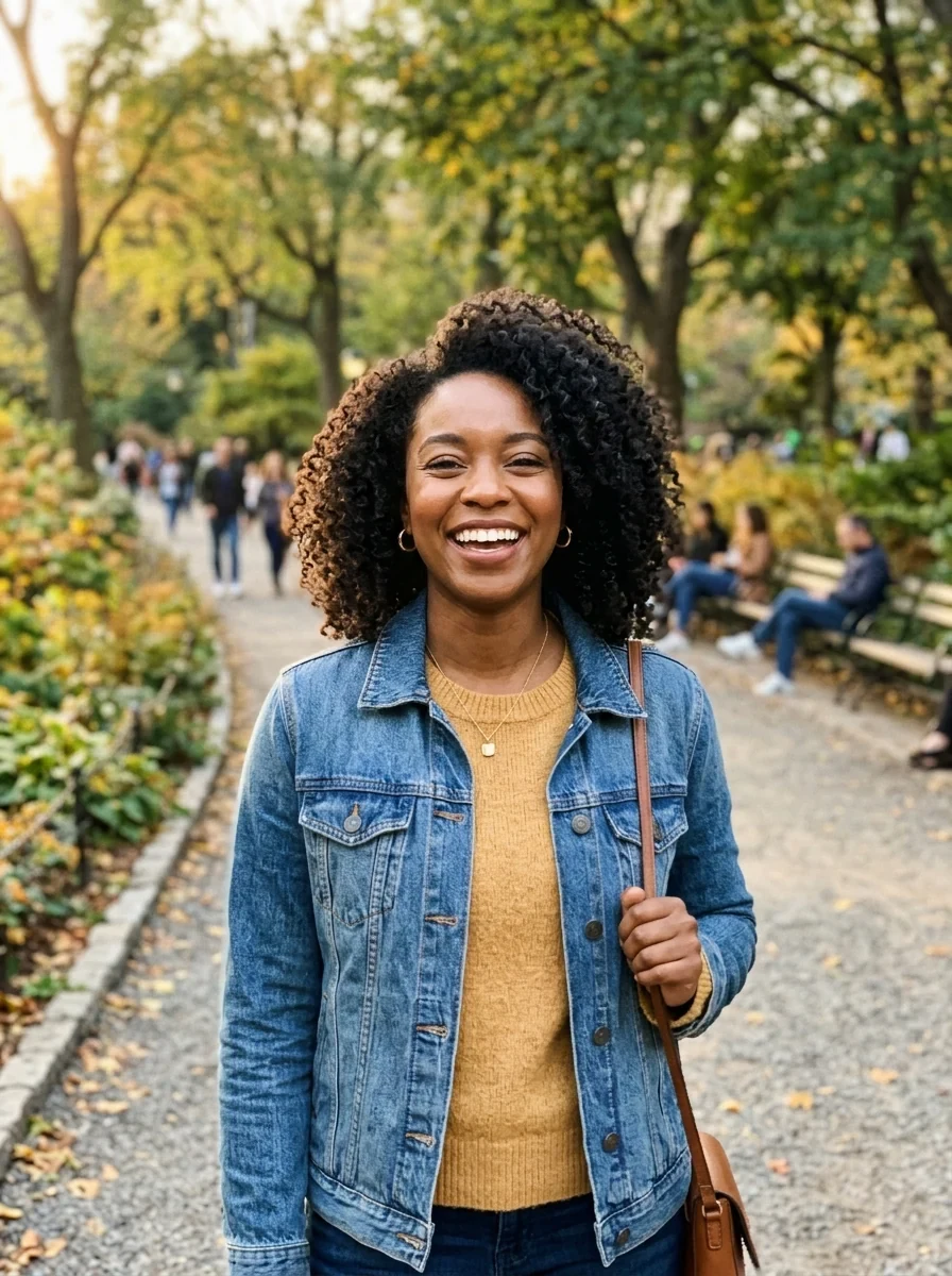
3 levels
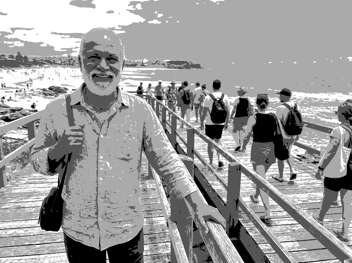
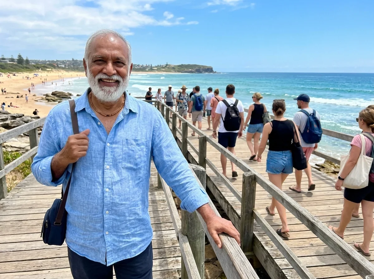
4 levels, black and white
Posterize Image features.
2 to 8 levels
Fewer levels give bolder, flatter shapes.
Color or black and white
Turn the photo grey first for a classic print look.
Live preview
The image changes as you move the slider.
Posterize Image, step by step.
01
Drop a photo
High-contrast photos give the cleanest shapes.
02
Set the levels
Start at 4 and go down for a bolder look.
03
Download
PNG keeps the flat colors crisp.
Posterize Image use cases.
- Screen printing and stencils
- Separate a photo into a few flat colors before printing.
- Posters and covers
- A graphic, retro look for flyers and album art.
Posterize Image: best photos and fixes.
Photos with strong shapes
Posterize groups similar tones into a few flat levels, so photos with clear light and shadow give the strongest shapes: portraits with side light, buildings against the sky, objects on a plain background. Busy, evenly lit scenes with many small details break up into noisy patches. Cropping to one main subject first usually helps.
Faces at low levels
Skin is where posterizing shows most. At two or three color levels, faces can break into blotchy patches, especially under mixed light. For portraits, use black and white, or four or more levels in color. Front light gives flat, simple shapes, while side light gives a strong split between light and shadow that reads well even at low levels.
Color or black and white
Color mode posterizes each color channel, which can produce unexpected bright shifts in skin and sky; that is part of the look. Black and white gives clean tonal steps, which is what you want for stencils, linocut sketches and single-color prints. For a set of posters, keep the same level count for a consistent style.
Noise and grain
Night photos and images from small phone sensors have grain, which turns into speckles along the edges between levels. Shrinking the photo before posterizing smooths that out, and so does starting from a cleaner, daylight photo. Screenshots and graphics with flat color already posterize cleanly at any level.
A value study for painting
Painters use three to five tones to plan light and shadow before they start. Posterize a reference photo in black and white at three, four and five levels, and you get that value study in seconds: it shows which areas should be darkest and lightest. Print it next to your easel, or use it to check a sketch.
Pop-art grids
A grid of the same portrait in four different posterized colors is a classic pop-art look. Posterize one photo in color at three or four levels, save it, then run the duotone tool on copies with different color pairs. Arrange them in a 2×2 grid in any layout app. Keeping the level count the same across all four gives a consistent set.
Shrinking file size for the web
Fewer color levels mean smaller PNG files, which can help for simple web graphics, icons and illustrations. Posterize a graphic to six or eight levels and save it as PNG; the difference is often hard to see, but the file can be much smaller. For photographs, JPG at a normal quality is still the better choice.
Posterize Image FAQ.
What does posterize mean?
It limits each color channel to a few values, so smooth shading turns into flat bands, like a print made with a few inks.
Which level count should I use?
3 or 4 for a bold graphic look, 6 to 8 to keep more detail.
Can I turn it into a stencil?
For a one-color cut stencil, try the AI stencil generator linked below.
Are my images uploaded?
No. The tool runs in your browser and the images never leave your device. Close the tab and they are gone.
Is it free?
Yes. Quick tools are free, need no sign-in and use no credits; your images stay in your browser. The AI tools linked below need an account.