









Duotone Photo
Turn a photo into two colors: one for shadows, one for highlights.
Drop a photo
or paste with ⌘V · JPG · PNG · WebP, stays on your device
No photo handy? Try one of ours.
 Style transfer →
 Album cover generator →
Duotone Photo examples.
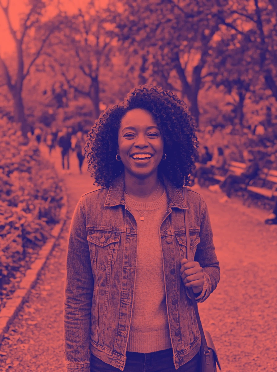

Blue and coral


Black and cyan
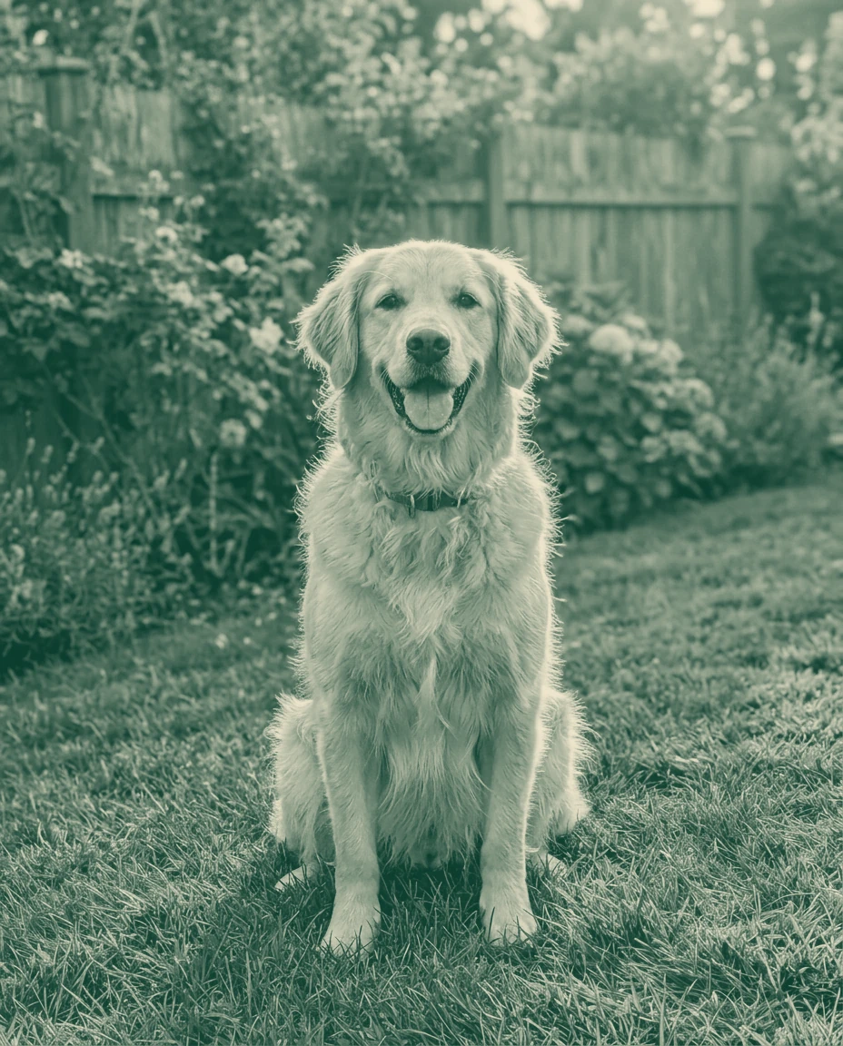

Green and cream
Duotone Photo features.
Any two colors
Pick the shadow and highlight colors yourself.
Six presets
Start from a tested pair and tweak it.
Contrast control
Push it for a punchy poster or soften it for a calm background.
Duotone Photo, step by step.
01
Drop a photo
Portraits and simple scenes work best.
02
Pick two colors
Or tap a preset.
03
Download
A JPG, ready to post or print.
Duotone Photo use cases.
- Brand graphics
- Photos in your brand colors for a website or social posts.
- Event posters
- A consistent two-color look across a set of photos.
Duotone Photo: best photos and fixes.
Photos that work best
Duotone maps the dark parts of the photo to one color and the light parts to another, so photos with strong contrast give the boldest result. Portraits with clear light and shadow on the face, city skylines and silhouettes against the sky all work well. Flat, grey photos with little contrast turn into a single wash of color; raise the contrast slider to separate them.
Contrast before color
Most of the look comes from where the midtones fall between the two colors. If faces turn into a flat block of one color, move the contrast slider until skin shows some of both. Very dark or very bright photos need more adjustment than evenly lit ones. Judge the result at the size it will be used, since thumbnails need stronger contrast than posters.
Matching brand colors
Take the exact colors from your brand guide and enter them with the color pickers. A near-black or a deep version of your brand color works best for shadows, and the brighter brand color for highlights. If your brand color is medium in brightness, pair it with black or white rather than a second brand color, so the photo keeps its detail.
A screen effect, not a print separation
The result is a normal color image that looks like a two-ink print. Real two-color printing, for screen printing or offset, needs each ink on its own layer, which a printer prepares from your artwork. Send the printer the duotone as a reference along with the original photo, and name the two inks.
Posters, covers and social posts
Duotone images work well behind large text, because the reduced color range keeps lettering readable. For an event poster or a cover, choose a highlight color light enough for dark text, or a shadow color dark enough for white text. Keep the same color pair across a series of posts so the set looks consistent in a grid.
Photos with a bright sky or window
Large bright areas, such as a white sky or a window behind someone, become a solid block of the highlight color. That can look bold, but it can also swallow the outline of a head or a building. Crop the bright area down before applying the duotone, or choose a highlight color that is not too pale, so the edge of the subject stays visible against it.
Duotone on a website
Duotone images are popular for website headers and team pages because they make photos from different sources look like one set. Use the same color pair for every image on the page, and crop or resize the photos to the header's shape before applying the effect. Check that text placed on top stays readable.
Duotone Photo FAQ.
What is a duotone?
An image made of two colors: the dark parts take one color, the light parts the other, with blends in between.
Can I use my brand colors?
Yes. Click either color box and pick your color; most browsers also let you type a hex code there.
Does it work on black and white photos?
Yes. Duotone only uses the brightness of the photo, so color and black-and-white photos both work.
Are my images uploaded?
No. The tool runs in your browser and the images never leave your device. Close the tab and they are gone.
Is it free?
Yes. Quick tools are free, need no sign-in and use no credits; your images stay in your browser. The AI tools linked below need an account.