








A logo won't make a business succeed, but a bad one makes it look less trustworthy. For a small business, the goal isn't a clever, award-winning mark. It's a logo that's simple, readable, fits your industry and works everywhere: on a sign, a receipt, an Instagram avatar and a browser tab.
Step 1: Write a one-paragraph brief
Before you design anything, answer these questions in writing:
- What do you do? In one sentence.
- Who are your customers? Age, taste, what they care about.
- What three words should people feel? For example: warm, local, honest. Or: precise, modern, fast.
- Who are your competitors, and what do their logos look like?
- Where will the logo appear most? Storefront, packaging, website, vans, social media.
This brief is your filter. Every design option either fits it or doesn't.
Step 2: Choose a logo type
- Wordmark: the business name in a distinctive font. Good for short names and service businesses. Examples: many law firms, consultancies, fashion brands.
- Lettermark or monogram: initials. Good for long names.
- Symbol plus name: an icon next to or above the name. The most flexible option for small businesses, because you can use the icon alone on social media.
- Emblem or badge: the name inside a shape, like a seal. Great for bakeries, breweries, barbers and anything with a craft or traditional feel.
- Mascot: a character. Friendly and memorable for food, kids' products and pet businesses.
Step 3: Pick colors with meaning
Color sets the mood before anyone reads your name. Common associations:
- Blue: trust, calm, professional. Finance, health, tech.
- Green: nature, growth, health. Gardens, food, wellness.
- Red and orange: energy, appetite, urgency. Restaurants, fitness.
- Yellow and gold: warmth, optimism, quality. Bakeries, cafés, premium goods.
- Black and white: elegant, simple, timeless. Fashion, design.
Pick one main color and at most one or two accents. Check that your logo also works in one color, black on white and white on black, because you'll need that for stamps, embroidery and receipts.
Step 4: Choose a font
- Serif fonts (with small feet) feel traditional, established and trustworthy.
- Sans-serif fonts feel modern, clean and approachable.
- Script fonts feel personal and elegant, but are hard to read at small sizes.
- Display fonts have character, but use them only for the name, not for everything.
Readability beats personality. Your name must be readable on a phone screen and from across the street.
Step 5: Generate concepts
This is where many owners get stuck. A fast way to explore directions is to generate a range of concepts and react to them. The logo generator creates an original logo from a description, with simple vector-style shapes and your business name spelled exactly as given. Choose transparent or white output.
Use your brief in the description:
- "minimal line logo for a plant shop called Fernway, green, a single fern leaf"
- "vintage badge logo for a barber shop called Iron & Oak, black and cream"
- "monogram logo for an accounting firm, initials KM, navy, serif"

 Logo generatorDesign a logo with a transparent backgroundTry it with your photo
Generate several rounds with different styles. Pick two or three favorites and show them to a handful of real customers. Ask "what kind of business is this?" rather than "do you like it?". The answers tell you whether it communicates.
Step 6: Test it everywhere
A logo has to survive real use. Test your favorite:
- Tiny: shrink it to 32 pixels, the size of a browser tab icon. Can you still recognize it?
- One color: does it work in black only?
- On dark and light backgrounds.
- On a product: a mug, a bag, a shirt, a sign.
- Next to competitors: does it stand out or blend in?
The mockup generator puts your logo onto a product photo, such as a mug, a bag or a candle, so you can see it in context before you print anything.

Step 7: Make the final files
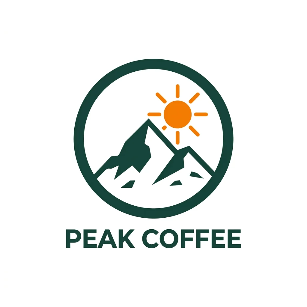
Once you've chosen, prepare a proper logo kit. A generated image is a great concept, but for the final files many businesses have the chosen design redrawn as a vector, either themselves in a vector editor or by a designer. Vectors scale to any size, from business cards to vans. From your vector master you can export transparent PNGs in any pixel size with SVG to PNG, and make lightweight web versions for your site header with PNG to WebP.
Your kit should include:
- Vector files: SVG, PDF or EPS for print and signage.
- PNG files with transparent background, in several sizes.
- Versions: full color, black, white, and the icon alone.
- A square version for social media avatars.
- A favicon for your website.
- A short note with your color codes (HEX for screens, CMYK for print) and font names.
Check that it's yours
Before you print anything, search for logos similar to yours in your industry and do a trademark search in your country. You don't want a cease-and-desist letter after ordering signage.
Common mistakes
- Too many colors, fonts or details.
- A trendy style that will look dated in two years.
- Clip art that other businesses also use.
- A logo that only works large.
- Skipping the one-color version.
Keep it simple, test it small, and use it consistently. A plain logo used everywhere builds more recognition than a brilliant one used inconsistently.