




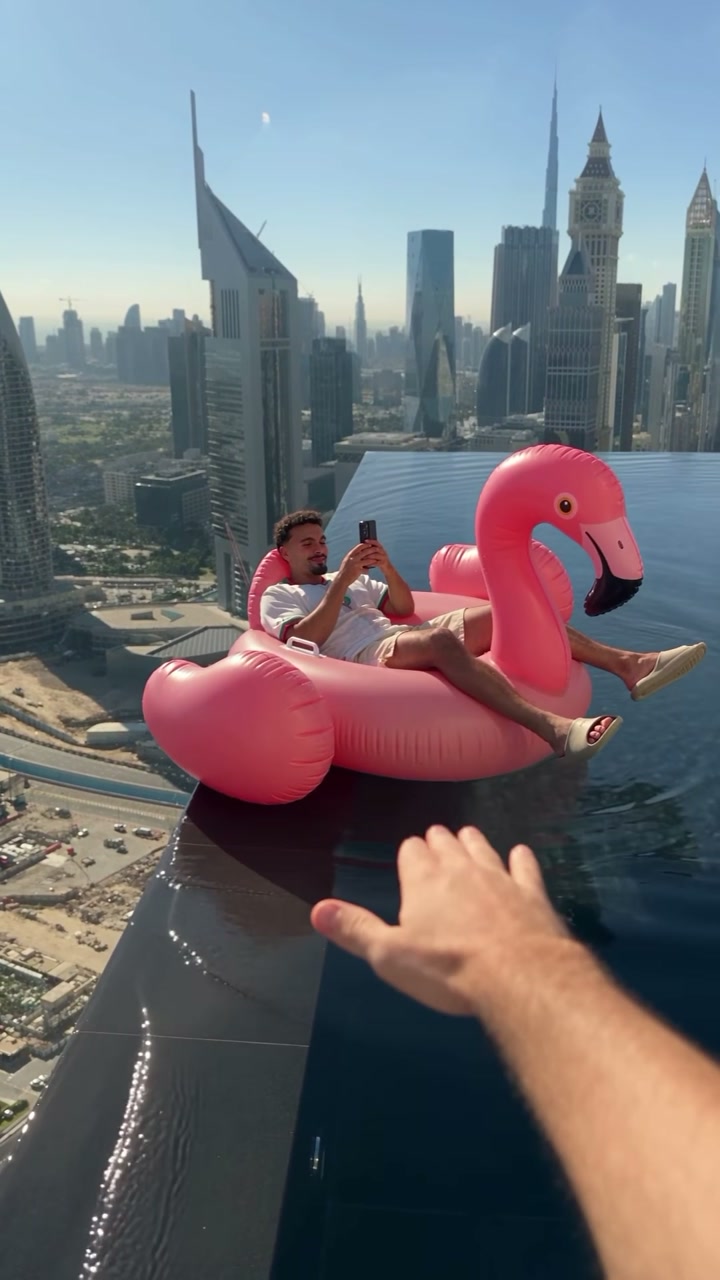

The thumbnail and title together decide whether someone clicks your video. A great video with a weak thumbnail gets ignored in a feed full of strong ones. The good news is that thumbnails follow patterns, and once you know them you can make a decent one for every upload.
The rules that apply to every niche
- Size: 1280 x 720 pixels, 16:9. YouTube requires at least 640 pixels wide and keeps custom thumbnails under 2 MB.
- Custom thumbnails need a verified account. Verify your channel with a phone number in YouTube Studio if the upload option is missing.
- Design for a phone. Most views come from mobile, where a thumbnail is about the size of a matchbox. Zoom out and check it at that size.
- One idea per thumbnail. One subject, one emotion, one promise.
- Three words or fewer. The title already explains the video. Thumbnail text should add something, not repeat the title.
- High contrast. Bright subject on a dark background or the other way around. Avoid mid-grey on mid-grey.
- Watch the bottom-right corner. YouTube puts the video length there, covering whatever is underneath.
Ideas by video type
Tutorials and how-tos
Show the result, not the process. A finished dish, a fixed bike, a clean spreadsheet. Add a short label like "5 MIN" or "EASY" if speed or difficulty is the selling point.
- Before and after split in two halves.
- The finished result large, with a small inset of the starting point.
- An arrow pointing at the one detail the video explains.

Reviews and comparisons
Put the product large and center. For comparisons, two products side by side with "VS" between them is a pattern viewers instantly understand. Your face reacting at the edge adds personality.
- One product on a clean, colored background.
- A row of products for "best of" lists, with numbers.
- A green check and red cross for "worth it or not".
Vlogs and travel
Lead with the place, not your face, unless your audience comes for you. Golden hour, a recognizable landmark, a strong color. A short location label helps viewers who search for a place.

Gaming
Bright, saturated colors and exaggerated moments. The character, the boss, the rare item, the moment of victory or disaster. A face with a big reaction works especially well in gaming.
Commentary and talking-head videos
Your face showing a clear emotion, cut out against a bold background, plus two or three words. The emotion should match the video: curiosity, shock, amusement, doubt.
Education and explainers
A simple diagram or a single striking image. A question in large text ("WHY?" or "HOW?") with the subject next to it.
How to make a thumbnail fast
Start from a generated design
The YouTube thumbnail generator makes a 16:9 thumbnail from a short description. Tell it the subject, the headline and the mood, for example "tech review, seven colorful mechanical keyboards, headline BEST BOARDS, bold and bright". It can render a short headline in the image. Use it as a finished thumbnail or as a starting layout to refine in your editor.
 YouTube thumbnail generatorBold 16:9 thumbnails from a short descriptionTry it with your photo
Cut yourself out of a frame
For talking-head and reaction thumbnails, take a still from your video or a quick photo with a big expression. Run it through the background remover with transparent output, then place yourself on a bright background in any editor. Add a white or colored outline around the cutout to separate it further.
Test and improve
YouTube Studio shows the click-through rate (CTR) for each video. Typical CTRs vary widely by niche, so compare against your own channel, not someone else's. If a video gets impressions but few clicks, the thumbnail and title are the first things to change. YouTube's "Test & Compare" feature, where available, lets you upload up to three thumbnails and see which one gets the most watch time.
A few changes that often lift CTR:
- A bigger face or subject.
- Fewer words.
- More contrast between subject and background.
- A clearer emotion.
- Removing small details that don't read on a phone.
Make it a series
Channels that grow tend to have a recognizable thumbnail style: the same font, the same color accent, the same layout. Viewers start to spot your videos in a crowded feed. Pick two colors and one font, and stick with them for a while.
Text that reads at a glance
When you do add text, use a heavy sans-serif font, all caps or title case, in white or yellow with a dark outline or shadow. Keep it to one line where possible, and put it where it doesn't cover the face or the product. Read it aloud: if it doesn't make someone curious in two seconds, cut it or change it.
Avoid these mistakes
- Misleading thumbnails. Viewers leave early, and that hurts the video more than a lower CTR would.
- Tiny text, thin fonts, or long sentences.
- Copying another creator's exact design.
- Copyrighted images you don't have rights to.
- Forgetting the time stamp in the corner.
Make two or three thumbnail versions for each video, look at them at phone size, and choose the one you understand fastest.